Impreza and Salient are both sold through the same marketplace and are therefore direct competitors. That is certainly the case since both themes can be used for the construction of very nicely looking webshops. Impreza vs Salient, which is the better theme? We start with Impreza which does not mean it would be better.
The Impreza Theme
The first thing I noticed when I came to their website and clicked on “Live Preview” is how well-organized and well-arranged they present the features of their theme itself. These are intelligent people, and it bodes well for the Impreza Theme itself. Impreza came on the market in 2013 and belongs to the older guard themes that have been continuously improved to date and belong to the best. Let’s start with this review.
Impreza's Rating

They indicate that they have the highest rating on Themeforest with their theme. The rating is 4.89 out of 5 and is indeed very high. I don’t know if I’ve ever seen a higher rating there, I don’t think so. Apparently people who bought this theme are extremely satisfied, very important if you are looking for a good theme to value the opinion of others.
Impreza's Loading Speed
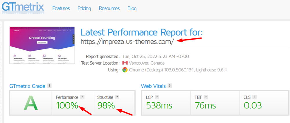
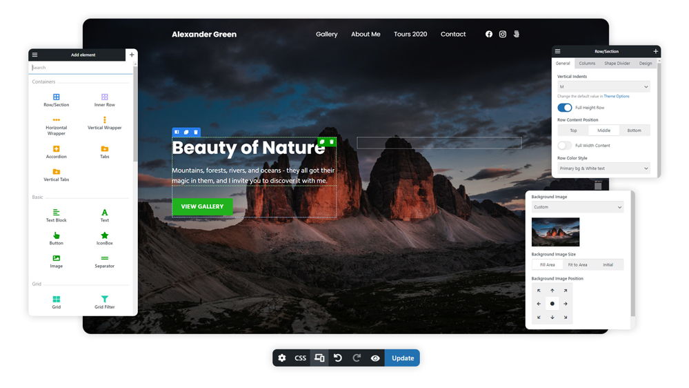
Live Visual Builder
The title says Live Visual Builder and it is, but this is a tuned version of the already good WP-Bakery page builder. One of the first page builders that is still among the best. Impreza itself provides a number of “Builders” which are listed below.
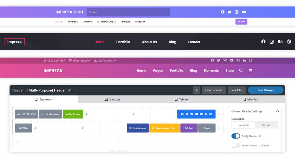
Impreza Theme Header Builder
There are themes that offer header styles, which is not the same as a header builder. Styles give you different options for header types that can be installed with 1 click. However, a true eheader builder gives you unlimited freedom in the placement of items in your header. Impreza is therefore among the best themes in the field for headers.
Impreza's Grid Builder
The Grid Builder, in the past many people bought plugins for this kind of thing, for example photo presentation on the site. It is no longer necessary to spend money on this, it is simply in the themes themselves these days.

Their Woocommerce Builder
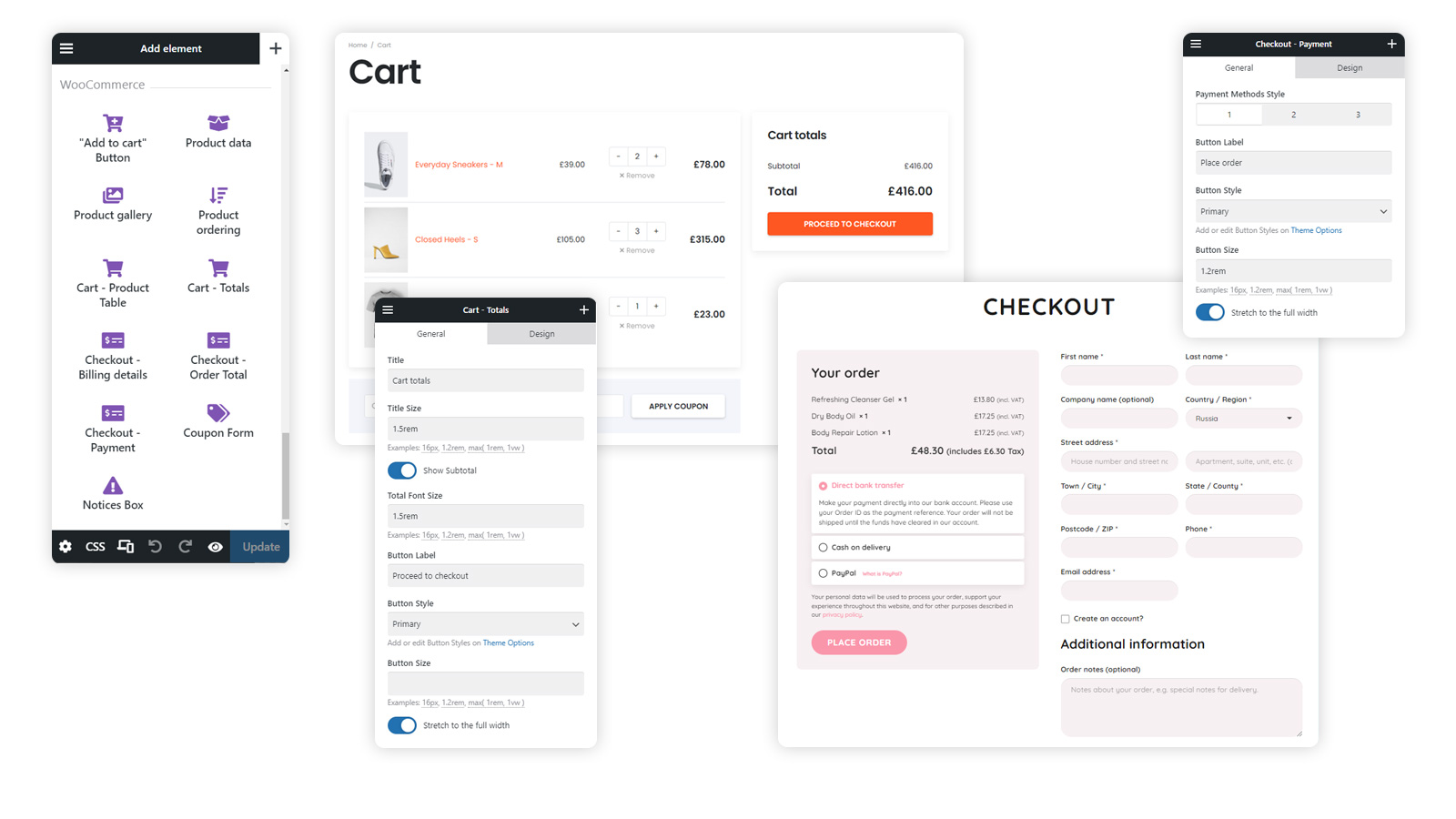
The Woo Builder, is something that Divi brought to the market. Divi basically develops everything that is new and the rest then copies it. A Woocommerce Builder gives you unlimited freedom to set up your cart, check out, product pages, my account, thank you page and more. I assume everyone knows what Woocommerce is, the most famous plugin for building shops.
Impreza Theme Review: Starter Sites
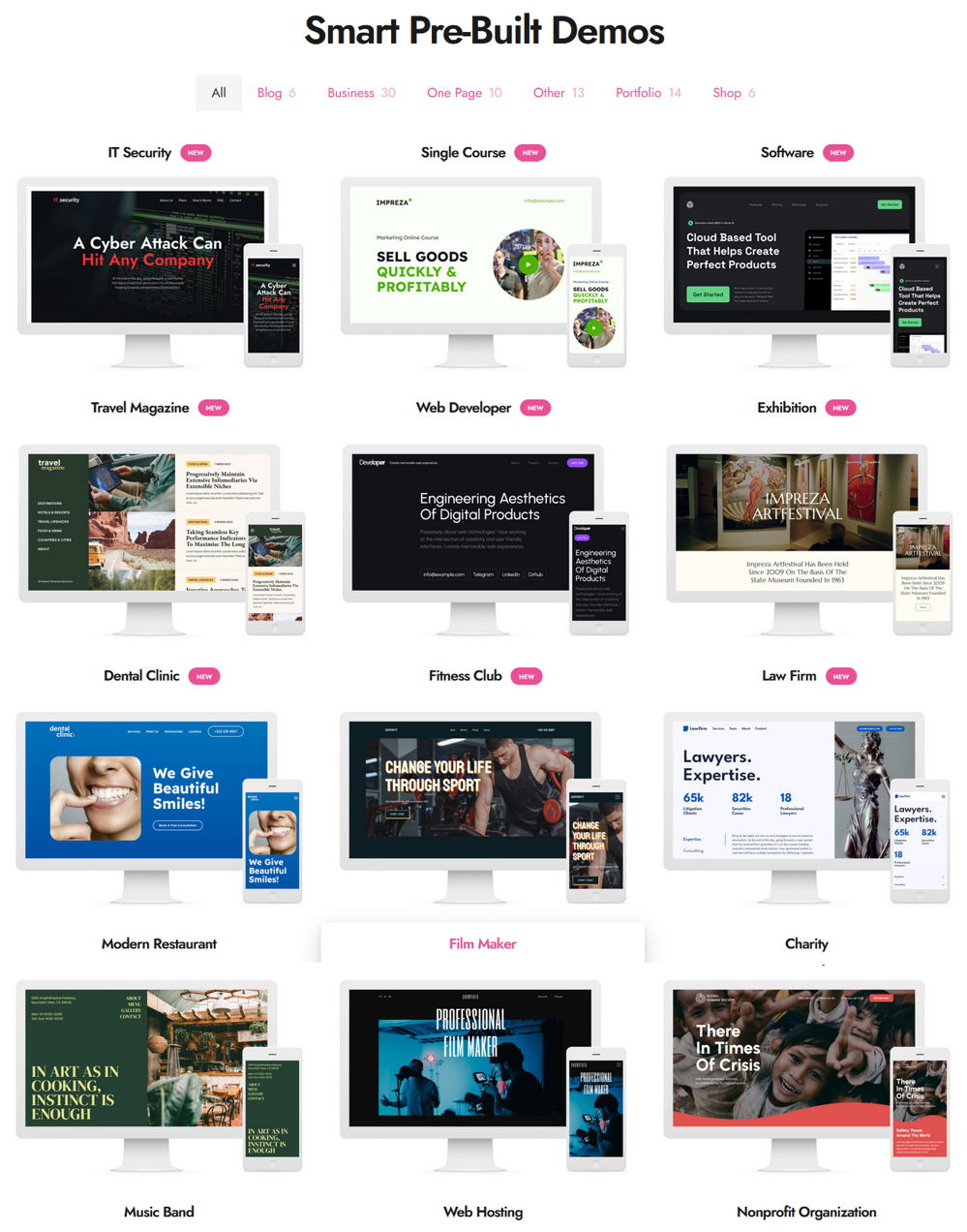
I count a good 80 starter sites. These are also called demos. A demo can be installed with a few clicks so that a complete website is immediately created with all important pages. You can then adapt this yourself to your house style by replacing the logo, texts and photos.
Portfolios
With the Grid Builder you can simply create your portfolio layouts yourself. Below is an example. For example, spin the items with the “Flip Box” that Impreza provides.

Impreza Theme Review Conclusion
Impreza scores in my review among the best themes on Themeforest. I like working with Elementor but I’ve worked with WP-Bakery for at least 5 years and it’s just a good page builder. The extras that Impreza adds makes everything even better. Impreza’s rating does not come out of the blue, it is a complete theme with which everything is possible. Recommended.
Let’s continue this Salient vs Impreza comparison with the Salient Theme.
The Salient Theme
The Salient theme was already released in 2013 and therefore belongs to the old guard of WordPress themes. It is still in the top 5 on Themeforest today which is a very good sign. So we are dealing with a top theme here. The theme is multipurpose but with an emphasis on webshop construction. Let’s start quickly with this Salient review.
Salient's Ratings

Salient has a rating of 4.81 out of 5 as shown in the screenshot above. That is, to say the least, a great rating that few themes have. This is the average rating of votes cast over almost 10 years. This indicates that the theme is stable and will have few or no errors.
Salient + Woocommerce
Salient is very suitable and offers many great options for building webshops. Below is a good example of the new layouts for your products. Photos in the form of a gallery where the product information is always visible. Modern 2-column layouts allow product images to be seen efficiently and keep the information and buying options visible at all times.
Gallery Images
Or this new Woocommerce feature. Your users can scroll through product images without having to stop at the thumbnails and information.
Scrollable Images
As seen in the video below, there is a “show filters” button which makes searching easier. You don’t have to choose between sidebars or full-page layouts for your products. Give your customers the ability to filter when they need it and keep your products focused until then.
New Filer Lay-out
I’m not going to list all Salient’s Woocommerce features here. Take it from me that Salient is a frontrunner in Woocommerce possibilities and if you are going to build a shop, Salient is definitely worth considering. More Woocommerce info can of course be found on their own site.
Salient Review: Demos
The site for Salient talks about 400+ templates they offer. I’m assuming that’s a combination of sections and full site demos. I count a total of 33 full site demos for Salient. That is certainly not a large number, but the demos are really beautiful, time has been spent on them. The demos shown below are demos for webshops.

Salient's Pagebuilder
As a page builder, Salient uses a high-quality version of the WP-Bakery page builder, an old very reliable and good page builder. This visual front-end Builder is tuned with many extra widgets what brings the total amount of widgets to 65+. Personally, I think they would do well to make their demos available for Elementor, the most popular page builder at the moment.
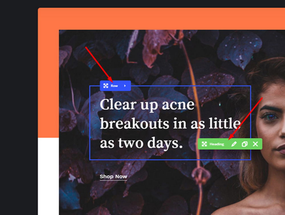
Responsive Editing
As befits a real page builder, you can edit responsively if desired. You can make separate adjustments to the design for mobile phone, iPad and Desktop. Of course all popular page builders can do this, but I’ll just point it out.
Portfolios

Salient is also a very good theme for those of you who want to build a portfolio website. The theme offers countless different layouts for full width, with column and the separate portfolio pages.
Special Features
Divi is no longer the only theme that is packed with features. Most themes have copied the majority of these features and benefit from this well. I’m not going to list all the features here, that would make this article way too extensive which is not necessary. If you want to see more, check out their own site.
Mix text with Images
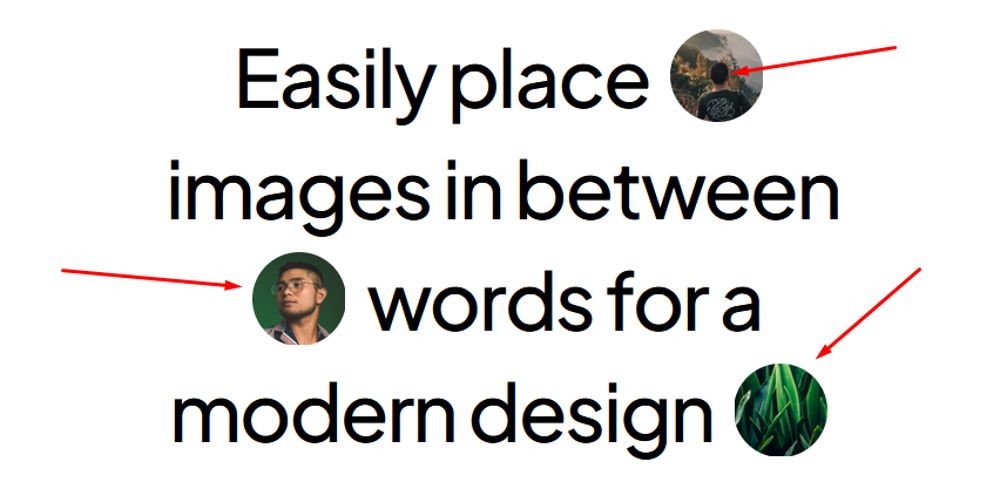
Scribble Text

Salient's Header Lay-Outs
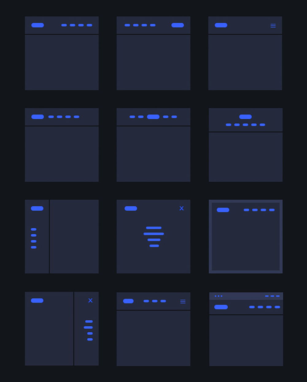
With just 1 click you can install another header. You can choose from a wide variety of header menus as shown below. Salient also has a header builder that allows you to make further customizations to your header.
Salient Theme Review Conclusion
The conclusion of my review is that Salient is highly recommended and as far as I’m concerned is in line with the 3 top themes on Themeforest. It has everything a good website needs and more. The things you can do with texts in Salient are really great and the theme is perfect for building a shop. The only problem with Themeforest themes is that you would have to buy a separate license for each of your sites. This while themes such as Astra and Divi are just as good and extensive and used on unlimited sites
Salient vs Impreza Conclusion
I like Impreza better, it is just better overall. But, these themes want to see a separate expensive license for every website you want to build with them. This will quickly cost you a lot of money. You are better off with Astra or Divi that can be used on an unlimited sites and are also even better and more stable themes.

