We are comparing Divi vs Gutenberg here. Gutenberg is the default page builder in WordPress and Divi is the best-selling page builder for WordPress. Can these 2 page builders be compared or is the difference between the two just too big?
The Divi Theme
There has been no theme that sells better than Divi in recent years. In this Divi Theme Review, we’re going to see if that’s the case again this year. Divi Theme does not have a free version so all its popularity is only due to their pro version which is remarkable. Most of the best-selling themes also have a free edition with which they have made a name for themselves. Divi is just so good, it sells itself.
Divi's Advanced Gradient Builder
So let’s get straight to the point and start with one of the two remarkable new features in Divi. The first is the Advanced Gradient Builder. With this tool you can create the same gradients for your background and the like as in Photoshop. Divi’s gradient tool does not mix 2 colors like the gradient tools of other themes, but as many colors as you want. Check it out below in the image or directly on the Divi site.
Divi's Lay-Out Cloud
Immediately the next spectacular feature is the Divi Cloud. Immediately the next spectacular features is the Divi Cloud. As you already know, you can use Divi on as many sites as you want after purchasing it. From all these websites you can access your cloud where you keep all your important building blocks that you may need on these sites. The photo below clearly shows what kind of things you should think about. This feature saves both professionals and do-it-yourselfers a lot of time. Immediately view the information that Divi itself provides about their new Cloud.
Divi Theme's Rating
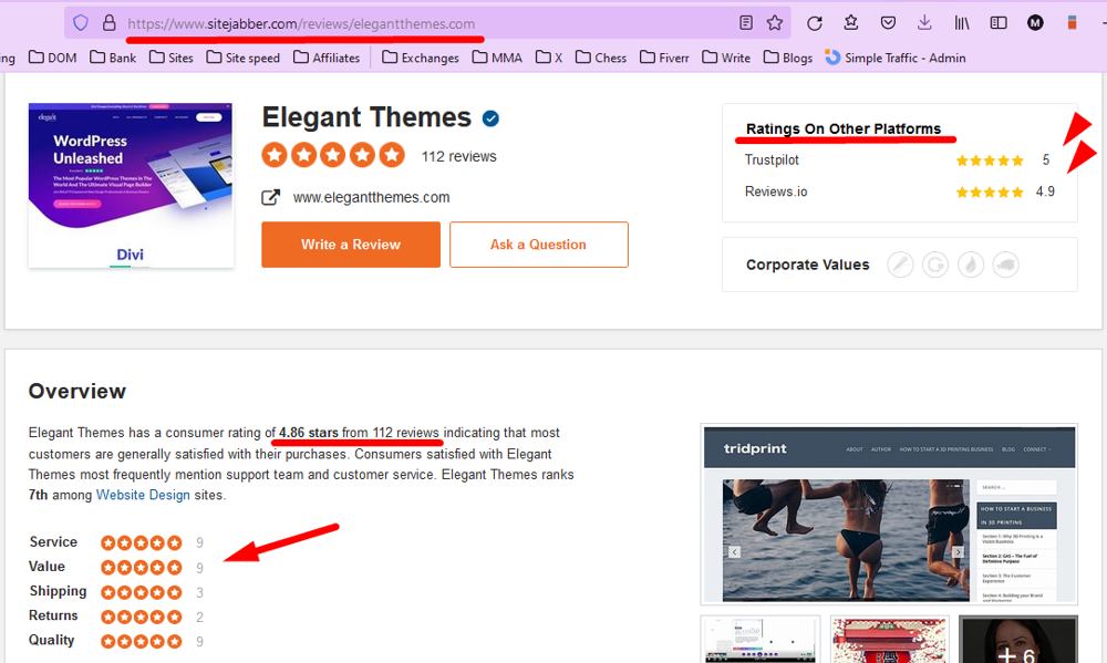
The Divi Theme was created by Elegant Themes which is a company that treats everybody right. This count for the clients that buy their themes, and also affiliate marketers. That everyone is extremely happy with Elegant Themes is easiest shown on a good review website like Sitejabber.com. On the image below are also the numbers from 2 other review site. They just score everywhere more or less 5 out of 5 on average.
Divi Theme Review Demos
Divi offers a very large number of demo websites and demo sections. The image below shows that for “Business” designs alone, there are 603 total layouts to choose from. With such an abundance of well put together designs, it is easy to find a suitable layout for every niche. Here you’ll find their complete demo library.
Divi Theme & Woocommerce
Have you always wanted to be able to customize all Woocommerce pages such as the product pages, check out and cart pages? With Divi that is all a piece of cake these days. Divi uses the so-called WooBuilder for this, the top of the line in this area.
Stunning examples of Woocommerce product pages can be seen here if you scroll down to half of the page and click on the 9 different demos there.
The DiviBuilder
Of course, the WooBuilder discussed earlier in this Divi Theme Review is part of the DiviBuilder. A lot more can be said about the DiviBuilder. For example, it has the best inline text editor on the market and is a well-oiled machine for the rapid construction of websites and webshops. Below is a quick demonstration of some features. The DiviBuilder can be tested by yourself here.
Divi Theme Load Speed
The loading time of websites is now of global importance and the latest speed upgrade that they have implemented at Divi is a good improvement, although Divi was already fairly fast. You can read more about this speed upgrade here.
Divi Theme Review Shape Dividers
You can create beautiful transitions between the different sections on your pages with this advanced tool. The same applies to backgrounds with, for example, transparent images. Here you can read more about Divi’s Shape Dividers (including video).
Divi Theme Effects
All wonderful what the Shape Dividers above can do, but with Divi you can apply many more effects and filters to your images, with Divi’s Effects. Here you can read more about Divi’s Effects (including video).
Divi's Split Testing
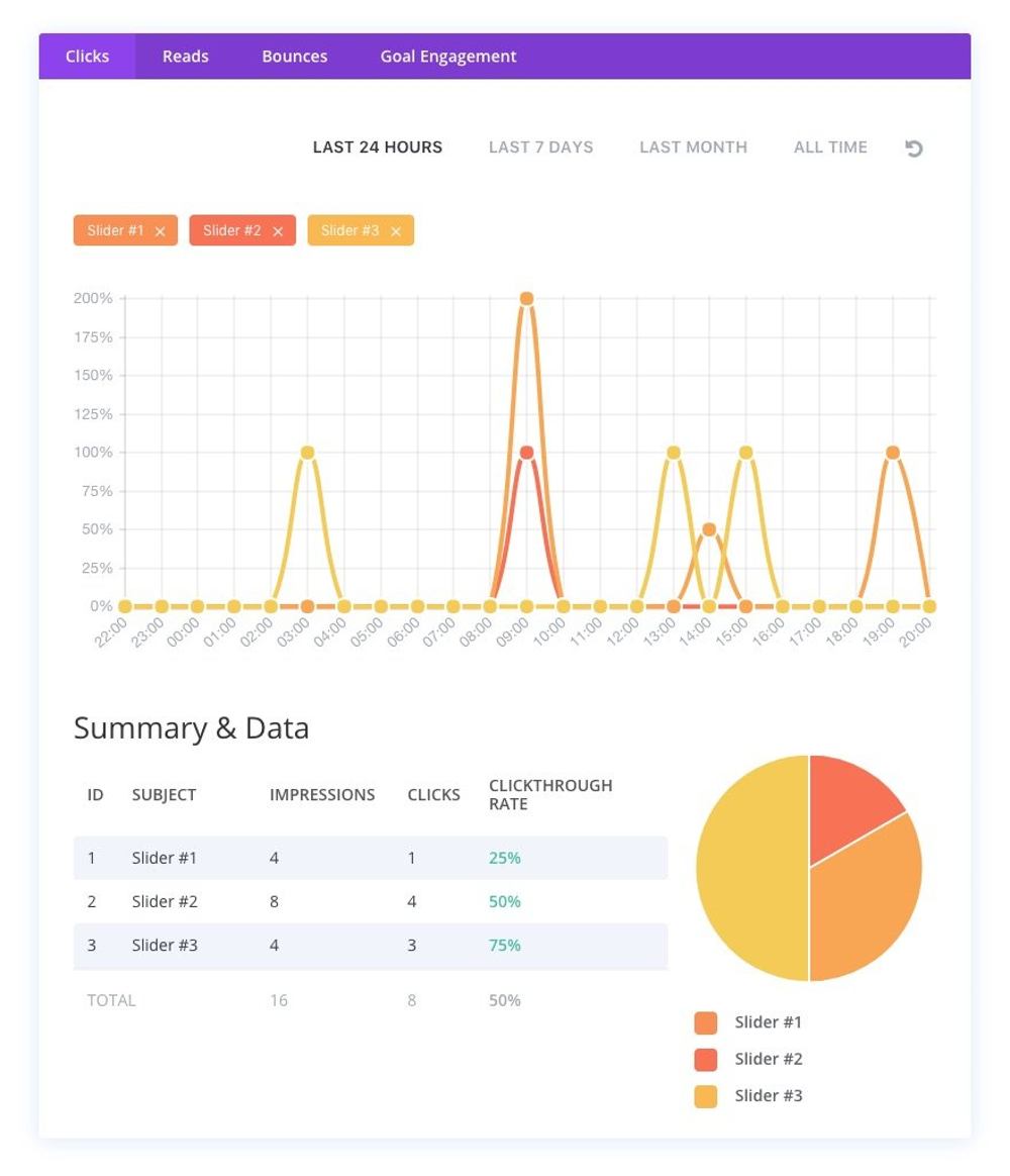
Split testing, also known as AB testing, is great for people who want to get the most out of their pages in terms of leads and conversion. Complete pages or parts thereof such as sections, images, or buttons can be made into 2 or more different versions that are alternately offered to the website visitors. Your own website keeps track of the statistics for you which version was more successful. Read here more aout Divi’s Split Testing.
Divi's Bulk Editing
Save a lot of work with this feature. In the past, many tasks within web design were performed countless times, which is of course very boring and tiring. What are the “Save as Global” and “Templates” with the Elementor page builder is called Bulk Editing with Divi. Read more about Divi’s Bulk Editing here.
Divi's Transforms
In the past, images were often modified in Photoshop before uploading them to a website. With Divi’s Transforms, that is no longer necessary. Standard images can be skewed and rotated in many ways. The handy thing about this is that you can make other adjustments later, just within the website itself. Here you can read more about Divi’s Transform (including video).
Divi Theme Review Conclusion
You will have noticed my enthusiasm for this theme in this complete Divi Theme Review. With Divi everything is possible and it is full of features that other themes do not have. It is not for nothing that Divi is the best-selling theme today, it is highly recommended. There is so much more to tell about Divi, but if your interest has been piqued, read on on their own website.
Let’s continue this Divi vs Gutenberg comparison with the Gutenberg editor.
The Gutenberg Editor
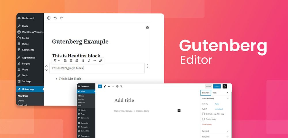
The Gutenberg Editor reminds me of the times when Joomla was even better and more popular than WordPress. Joomla 1.5 was a great CMS but somehow Joomla itself decided to kill everything with changes to their CMS. At one point they even released Joomla 2.5. It was not possible to upgrade from previous versions. This caused anyone who had a Joomla website to rebuild it. Many people, myself included, thought it was better to switch to WordPress at that point. Let’s continue this Gutenberg Review.
Gutenberg Editor Ratings
In my opinion, integrating the Gutenberg Editor into WordPress has also been a very big mistake. We now have an editor in it that most people don’t do anything with. You would say that the old WordPress editor was good enough and if you want something better, you install the DiviBuilder or the Elementor page builder. Well, that is still the case today because there are just few people who like to work with Gutenberg, what can be read from its rating.

An average rating of 2.1 out of 5 is of course incredibly bad. Well-rated themes and plugins on WordPress.org have averages above 4.5/5. Shockingly, so many people are commenting that it’s the biggest mess they’ve ever seen. The WP Classic Editor has a 4.9/5 rating as can be seen below.

WYSIWIG front-end pagebuilder
In principle, Gutenberg is a WYSIWYG frontend page builder, but in reality it is not impressive at all. The most striking thing about the Gutenberg editor for me is that if you paste a piece of text in it that also contains titles, the editor itself neatly divides it into separate blocks. Which in itself should be fast-acting and handy, but in practice people always want it slightly different than Gutenberg does and it takes a lot of time to get it “right” again.
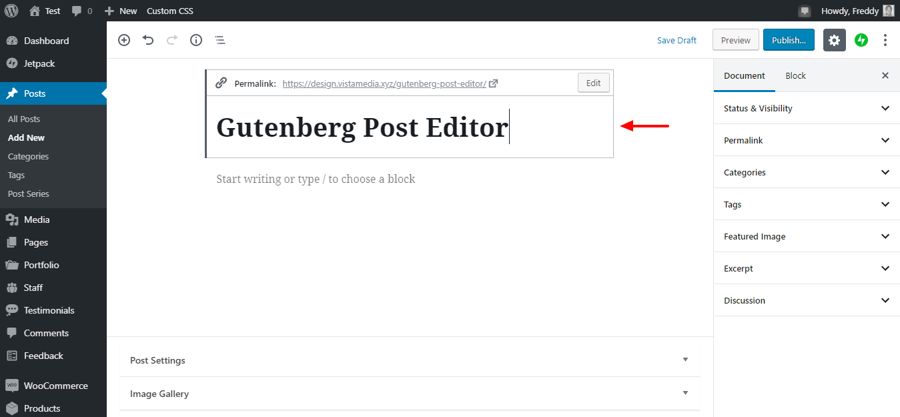
Backend Editor
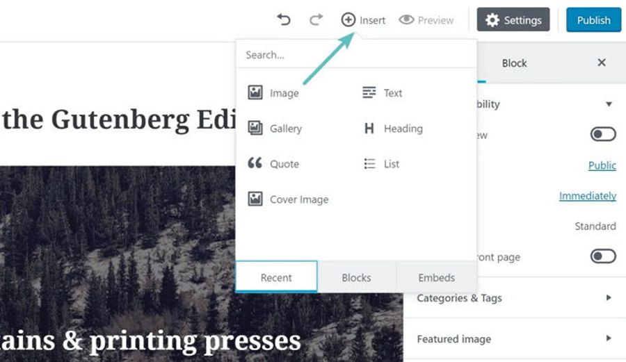
Frontend Editor
Using special plug-ins
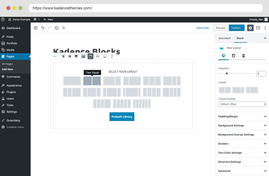
There are a number of special plugins that make the Gutenberg editor a kind of page builder that works a bit better than with the original. One of the best of these is Kadence Blocks, pictured below. The question is why don’t we immediately install Elementor if we don’t want anything to do with the original Gutenberg Editor.
Advice: Don't use Gutenberg
My advice from this Gutenberg Review is not to use the editor. When I build a website, I want everything to work perfectly and to have total control over everything. I therefore strongly advise against building websites with Gutenberg because later you are stuck with it. It is better to work with a good page builder from the start. I think the free version of Elementor is the most suitable for this, but I also like to work with the DiviBuilder, Thrive and ZionBuilder. What Elementor has that the other page builders don’t is the ability to extend it with a sea of plugins available for it. Many premium themes also already have tuned versions of Elementor in them.
Use the Classic WP Editor
Instead of acting as a Gutenberg guinea pig do the following. If you were used to working with the Classic WP Editor, you can just make Gutenberg disappear with one of the plugins for it, the best being Disable Gutenberg. Then simply install the Classic WordPress Editor and you will have the old familiar situation back.
Gutenberg Review Conclusion
Apart from the fact that the editor doesn’t work well and is practically still in beta after years, the editor has nothing to offer of course. A handful of widgets just isn’t enough these days to write decently attractive pages. Just ignore Gutenberg and work with a good page builder is what I do myself.
Divi vs Gutenberg Conclusion
We have come to the end of this Gutenberg vs Divi comparison. Of course, these 2 page builders cannot be compared with each other. Divi is the best page builder for WordPress right now, and Gutenberg the worst. Of course Gutenberg is free, but there are many free page builders that are 10x better so money is not the point here.


