Phlox and Bridge are both sold through the same marketplace and are therefore direct competitors. That is certainly the case since both themes can be used for the construction of very nicely looking webshops. Phlox vs Bridge, which is the better theme? We start with Phlox which does not mean it would be better.
The Phlox Theme
As a matter of fact this website you are looking at right now, I built it with Phlox Premium and Elementor. I can tell you right away that this is a great theme, but we’re going through all the points of the theme so slowly. Phlox was launched back in 2013, a golden age for WP themes.
Phlox Themes' Rating

The Phlox Theme has a free version with a rating of 4.8 out of 5 as seen above. The premium theme has an average rating of 4.66 out of 5. With these figures, the Phlox theme is among the best rated themes on Themeforest.
Loading Speed
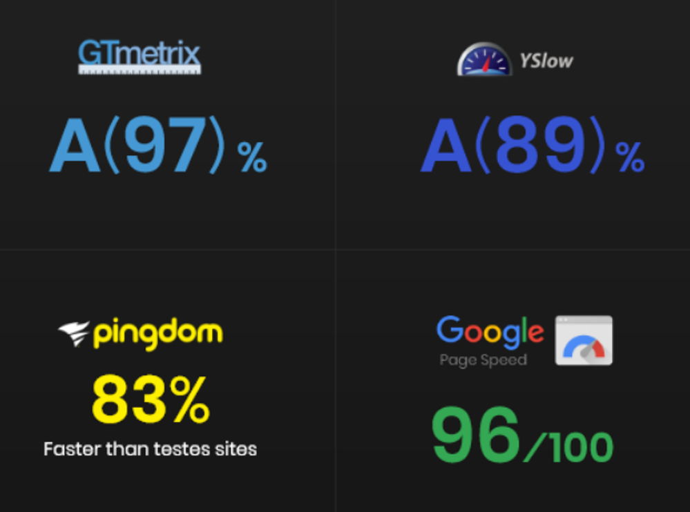
The Phlox theme has impressive loading times as can be seen below in the 4 completed tests. However, there are faster themes, such as Astra. Such fast loading times are always achieved with an elite cache plugin.
Phlox's Page Builder

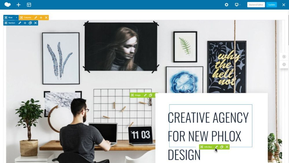
Phlox is a so-called Elementor Theme, which means built to support Elementor. Building the website practically only happens with Elementor. What I needed Phlox for was a beautiful demo website from which I could start my site. The demos of Elementor Pro itself I found a bit disappointing.
160+ extra Widgets in Elementor
Purchasing Elementor Pro is made completely unnecessary by the many extra widgets offered by Phlox within the page builder, 160+ to be precise. An unprecedented number of extra widgets which offers practically unlimited possibilities.

A Second Page Builder

You also get the Bakery page builder as a tuned version with about 60 extra widgets in it by Phlox.
Building a Blog
We call the structure of this website a blog. If you click on “Blog” in the menu or on “Compare Themes” you will see the blog layout. There are dozens of settings what people do and don’t want to show in the items. My experience with the Phlox theme for blogs is very good, this site is like my baby everything works so well. So if you want to build a blog, Phlox is definitely a good choice.
Phlox offers a variety of layouts and options to help you become a professional blogger, or just to get started in the blogging world. You can do everything with blogging. Phlox uses best practices in typography design to ensure that content is easily readable on all devices. Phlox supports all types of blogging, including grid, masonry and timeline. It also covers layouts such as tile, land and classic.
Phlox Theme Review: Starter Sites

I just mentioned that I had selected Phlox on its beautiful demo websites, in total there are 190+. These come in different specializations such as blogs, shops, corporate and much more. The layouts are of extremely high quality. As far as I’m concerned, Phlox is even undervalued with its rating.
Reuse Sections
Being able to save and reuse sections at lightning speed is a great feature. It says “Exclusive” in the corner but there are many more themes that have this.
Phlox: Global Colors
The theme uses 3 basic colors that are used throughout the site. If you adjust it, it will automatically adjust across the entire site. Doesn’t seem like a real exclusive feature to me, but it’s certainly practical.
Headers and Footers
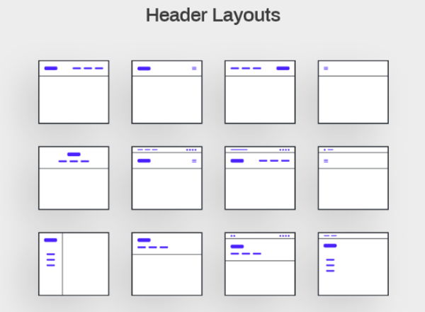
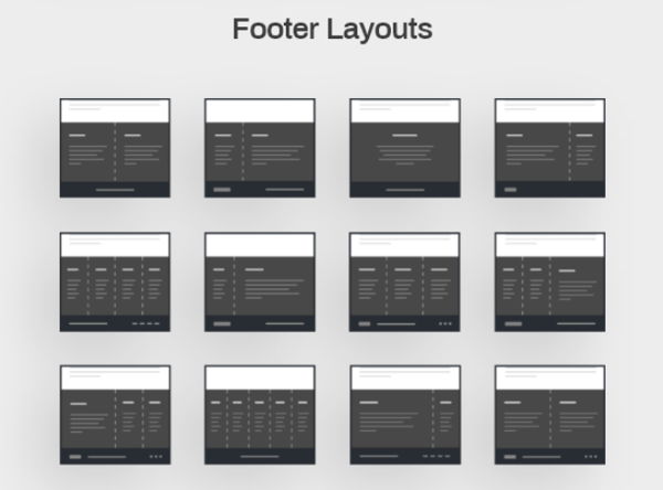
The Phlo theme offers a complete collection of options for both footers and headers. There will certainly be something to your liking for your website. You can make further adjustments to your chosen design with the Header & Footer Builder.
Phlox Theme Review Conclusion
I assume that you have received a very positive impression of Phlo by now, this is a great theme. I can’t copy all the information here, not 1 on 1. If your interest has been piqued, read on on their own website. As far as I’m concerned, Phlox is one of the better themes on Themeforest and highly recommended.
Let’s continue this Bridge vs Phlox comparison with the Bridge Theme.
The Bridge Theme
In this Bridge theme review we look at how this theme scores on a number of important points. Which page builders are used, what are the features for webshops, how fast does it load, and what other striking features are there. Bridge was launched in 2014 by Qode, a Power Elite Author.
Bridge Theme Rating

A good theme is immediately recognized by a good rating that has been built up over the course of at least a few years. That is more than the case with the Bridge theme. With a rating of 4.78 out of 5, it ranks highest on the Themeforest marketplace.
Bridge's Pagebuilders
The demos of the Bridge theme can be edited with 2 well-known page builders, namely Elementor and WP-Bakery. I definitely prefer the former, although I also like working with the Bakery page builder. Bridge doesn’t target Gutenberg at all, which is a good thing. Gutenberg is a complete disaster and will never be a success.

Bridge Review: Demos
The Bridge theme comes with more than 610 demo websites. About 250 of these were made for Elementor, and a sloppy 350 for WP-Bakery pagebuilder. A good theme comes with many and well-styled demos and you are in the right place with Bridge. All these demos can be easily installed with 1 click, then you can continue working on them with your favorite page builder.

Bridge Review: Headers
A beautiful collection with all kinds of differently styled headers has been well thought out. I hope everything on the screenshot shows well, otherwise go to their own site and check out the layouts there.
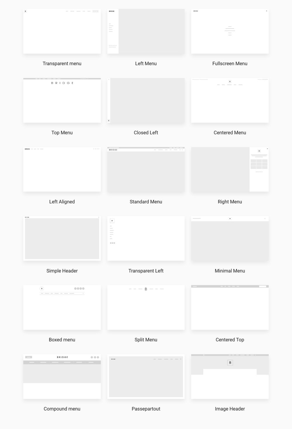
Bridge Review: Blog
The variety in blog layouts is also striking, this has also been well thought out. The Bridge theme is also ideal for building blog websites. View the various options that Bridge offers below.

Bridge Review: Portfolio
I must honestly say that the Bridge theme is suitable for practically any type of website. For corporate websites, for shops, for blogs, and for very specific niches such as travel, education or music sites. Below is a screenshot of a 4-column portfolio layout. Bridge also offers great versatility and options when it comes to portfolios.

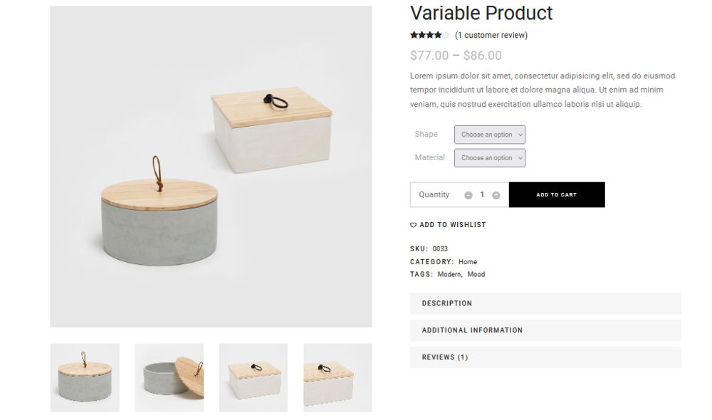
Bridge Webshops
With Bridge you can build very good professional shops. You have tons of beautiful shop designs and shopping widgets at your disposal to make a success of your webshop.
Special Features
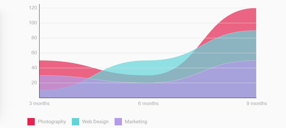
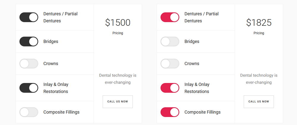
Bridge is packed with special features and I’m not going to list them all here. I show three of them below, you can view the rest on the Bridge website.
Build beautiful graphs with the Bridge Line Graph feature.
For your online business the Bridge Pricing Calculator will always come in handy.
The Bridge cross-fade images gives a different view of images.

Bridge Theme Review Conclusion
This Bridge theme review is coming to an end, I’ll give you my overall opinion about it. There is no denying that Bridge is a great theme. One can really build any type of website with it, it has several good page builders in it and has a lot of good demo websites. Furthermore, it has many wonderful extra features and settings so that everything can be adjusted without technical knowledge.
Bridge vs Phlox Conclusion
I like Phlox better, it is just a bit better overall. But also, these themes want to see a separate expensive license for every website you want to build with it. This will quickly cost you a lot of money. You are better off with Astra or Divi that can be used on an unlimited sites and are also even better and more stable themes.


