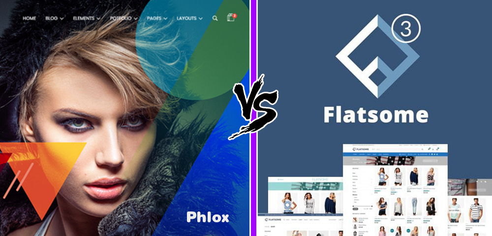
Phlox and Flatsome are both sold through the same marketplace and are therefore direct competitors. That is certainly the case since both themes can be used for the construction of very nicely looking webshops. Phlox vs Flatsome, which is the better theme? We start with Phlox which does not mean it would be better.
The Phlox Theme
As a matter of fact this website you are looking at right now, I built it with Phlox Premium and Elementor. I can tell you right away that this is a great theme, but we’re going through all the points of the theme so slowly. Phlox was launched back in 2013, a golden age for WP themes.
Phlox Themes' Rating

The Phlox Theme has a free version with a rating of 4.8 out of 5 as seen above. The premium theme has an average rating of 4.66 out of 5. With these figures, the Phlox theme is among the best rated themes on Themeforest.
Loading Speed
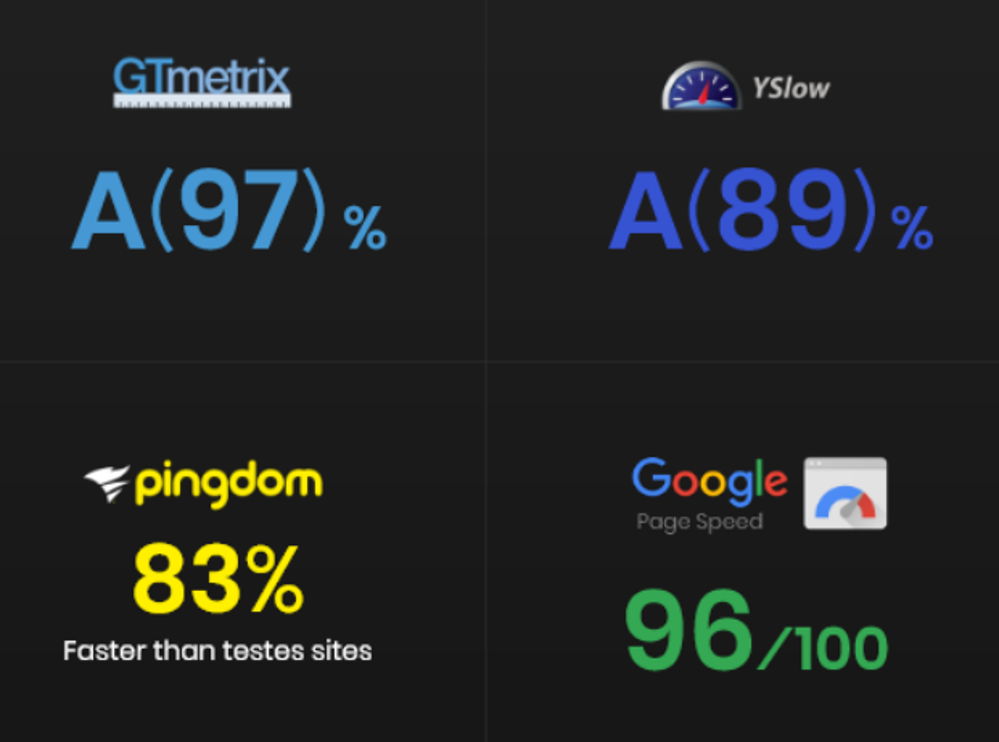
The Phlox theme has impressive loading times as can be seen below in the 4 completed tests. However, there are faster themes, such as Astra. Such fast loading times are always achieved with an elite cache plugin.
Phlox's Page Builder

Phlox is a so-called Elementor Theme, which means built to support Elementor. Building the website practically only happens with Elementor. What I needed Phlox for was a beautiful demo website from which I could start my site. The demos of Elementor Pro itself I found a bit disappointing.
160+ extra Widgets in Elementor
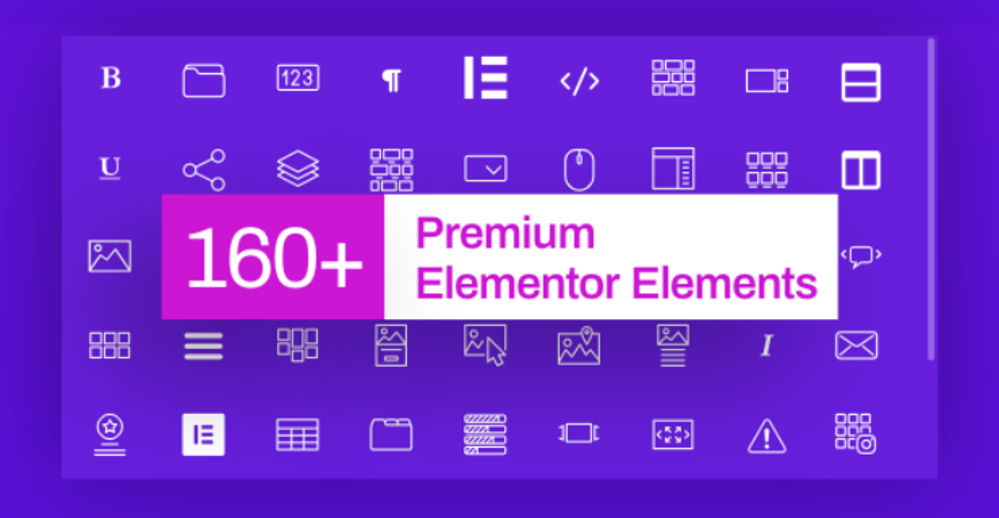
Purchasing Elementor Pro is made completely unnecessary by the many extra widgets offered by Phlox within the page builder, 160+ to be precise. An unprecedented number of extra widgets which offers practically unlimited possibilities.
A Second Page Builder
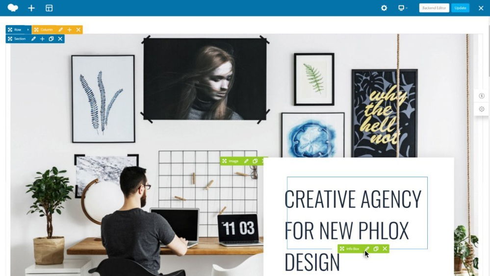

You also get the Bakery page builder as a tuned version with about 60 extra widgets in it by Phlox.
Building a Blog
We call the structure of this website a blog. If you click on “Blog” in the menu or on “Compare Themes” you will see the blog layout. There are dozens of settings what people do and don’t want to show in the items. My experience with the Phlox theme for blogs is very good, this site is like my baby everything works so well. So if you want to build a blog, Phlox is definitely a good choice.
Phlox offers a variety of layouts and options to help you become a professional blogger, or just to get started in the blogging world. You can do everything with blogging. Phlox uses best practices in typography design to ensure that content is easily readable on all devices. Phlox supports all types of blogging, including grid, masonry and timeline. It also covers layouts such as tile, land and classic.
Phlox Theme Review: Starter Sites

I just mentioned that I had selected Phlox on its beautiful demo websites, in total there are 190+. These come in different specializations such as blogs, shops, corporate and much more. The layouts are of extremely high quality. As far as I’m concerned, Phlox is even undervalued with its rating.
Reuse Sections
Being able to save and reuse sections at lightning speed is a great feature. It says “Exclusive” in the corner but there are many more themes that have this.
Phlox: Global Colors
The theme uses 3 basic colors that are used throughout the site. If you adjust it, it will automatically adjust across the entire site. Doesn’t seem like a real exclusive feature to me, but it’s certainly practical.
Headers and Footers
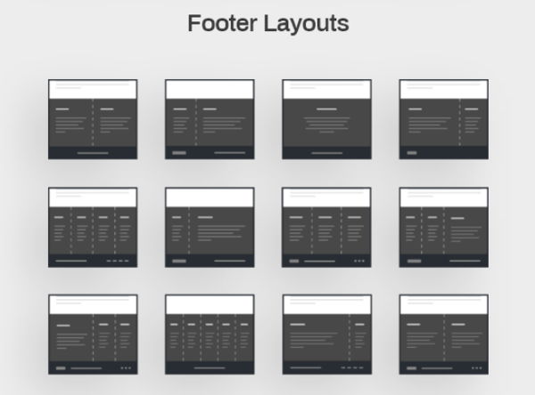
The Phlo theme offers a complete collection of options for both footers and headers. There will certainly be something to your liking for your website. You can make further adjustments to your chosen design with the Header & Footer Builder.
Phlox Theme Review Conclusion
I assume that you have received a very positive impression of Phlo by now, this is a great theme. I can’t copy all the information here, not 1 on 1. If your interest has been piqued, read on on their own website. As far as I’m concerned, Phlox is one of the better themes on Themeforest and highly recommended.
Let’s continue this Flatsome vs Phlox comparison with the Flatsome Theme.
The Flatsome Theme
Flatsome is a WordPress theme that is totally specialized in E-commerce or building webshops. The theme works perfectly together with the Woocommerce plugin that is used by everyone today to create shops. This Flatsome Theme Review gives you a bird’s eye view of all its best features.
Flatsome Theme Review Studio
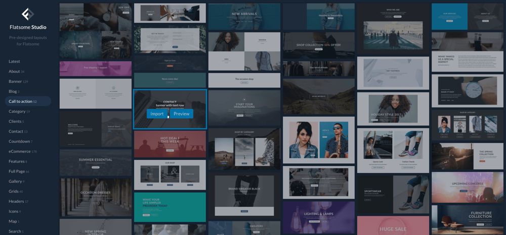
Apart from a single professional designer, there is really no one left who starts a website from scratch. Practically all themes (also free) offer a wide range of complete demo websites and many more prepared sections. The Flatsome theme is not left behind and now has 300+ pieces in its range. With no more than 1 click you can install such a design in your website and from there you start working on your own corporate identity. All you have to do is delete what you don’t want to use and replace the rest of the images and texts with your own.
Flatsome's Loading Speed
Flatsome has heavily improved the loading time of the theme with one of the latest upgrades. The alleged data shown in the image below seems a bit exaggerated to me and I have not checked. It is clear that the theme is fast. As you probably know, Google and visitors place great value on fast-loading websites.

Flatsome's UX Page Builder
The UX page builder was invented by the builders of Flatsome. And although it may not be the DiviBuilder or Elementor, this page builder works great and you will definitely like it. Watch the video below to understand a bit more about the UX Builder.
Woocommerce Features
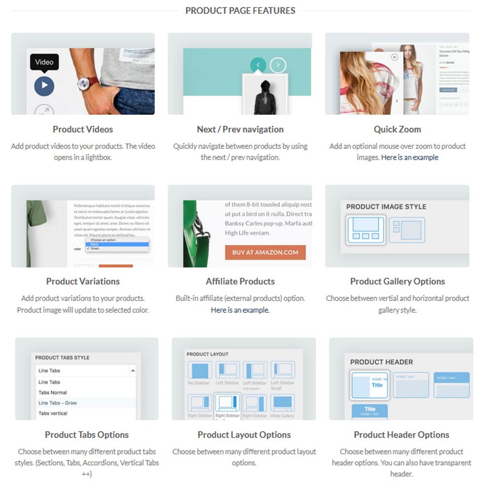
Flatsome is a real Woocommerce theme and is full of professional gadgets that make every webshop a success. I can’t show everything in this Flatsome Theme review, those features below are just a part. If you like to see them all, check out Flatsome’s own website.
Woocommerce Product Pages
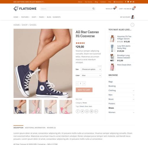
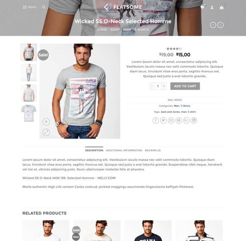
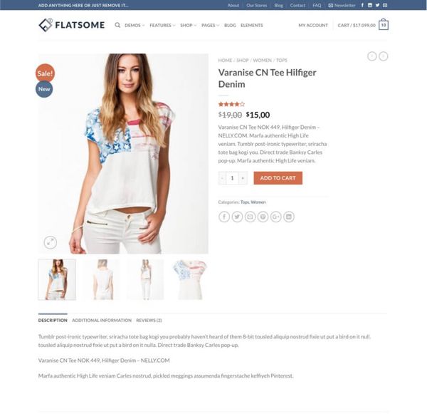
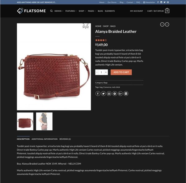
Flatsome comes with beautifull pre-designed product pages. With Flatsome it is also possible to use different styles with different products, as many as you want. There are few themes that offer such a wide range of Woocommerce pages, this feature is very nice.
Flatsome Shape Dividers
Divi was the first with Shape Dividers, then Elementor I think, now they all come with it and so is Flatsome. The best are still Divi’s. Of course I have nothing against the Shape Dividers, they are wonderful toys with which you can create beautiful borders between sections.


Flatsome's Headers
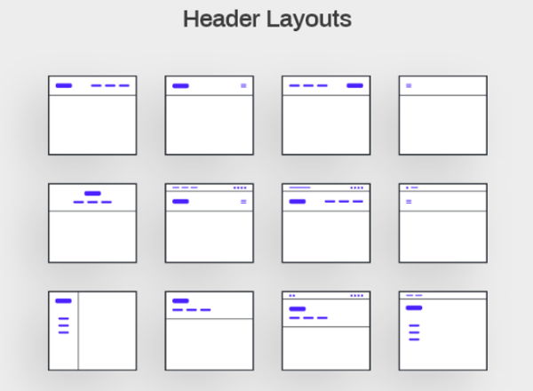
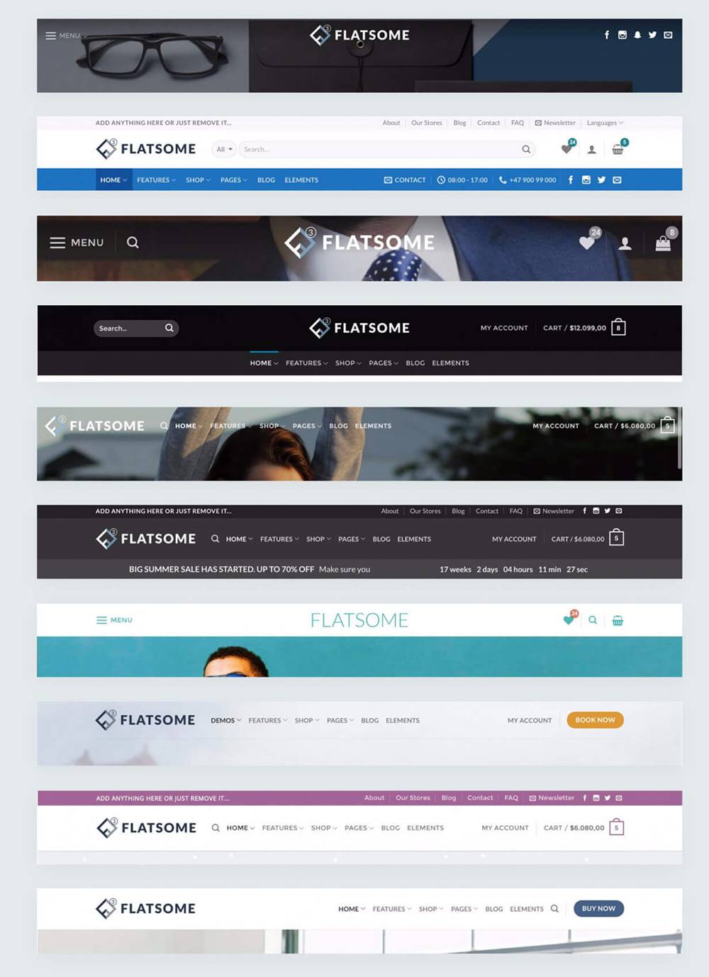
An impressive feature in Flatsome is the number of different headers that the theme makes available. Aside from the standard headers, there is also a header builder that allows you to customize every little detail in your chosen header. Below you can see a number of these headers.
Flatsome Review Elements
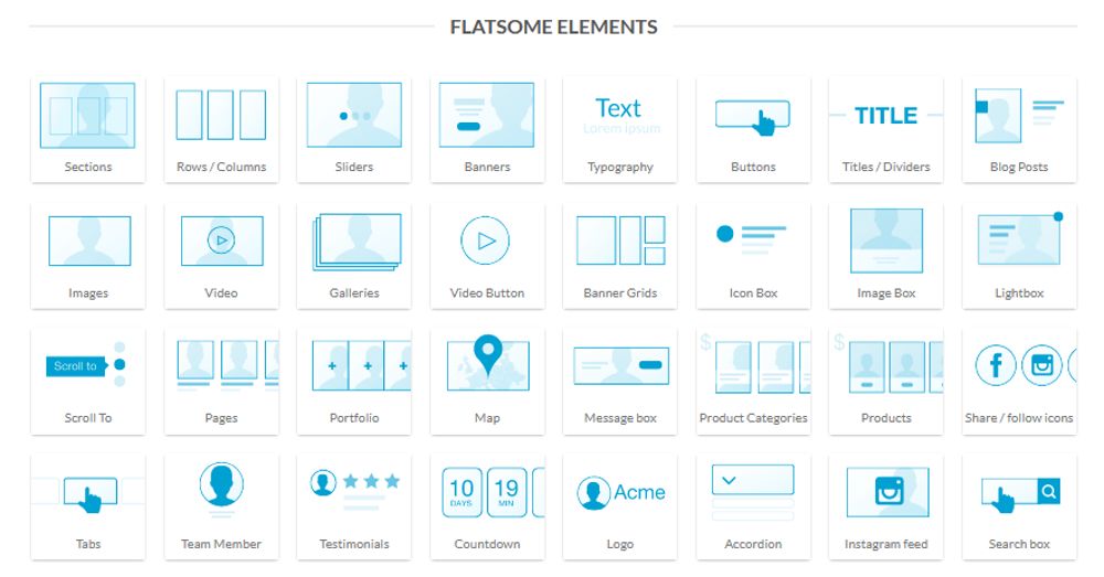
The Flatsome theme comes with a nice number of widgets in its UX-Builder. I say a nice number because of course we cannot compare this with the huge range that an Elementor page builder has to offer. Below are the main widgets in the image.
Flatsome Theme Review Conclusion
During this Flatsome Theme review I showed you the most striking features for me. We can safely say that Flatsome is a great theme for creating webshops. This is what it was made for from the start. The fact that it is also a corporate theme was only added later and for such websites I would certainly prefer to use a theme like Divi or possibly another good theme with the Elementor page builder.
Flatsome vs Phlox Conclusion
I like Woodmart better, it is just a bit better overall. But also, these themes want to see a separate expensive license for every website you want to build with it. This will quickly cost you a lot of money. You are better off with Astra or Divi that can be used on an unlimited sites and are also even better and more stable themes.


